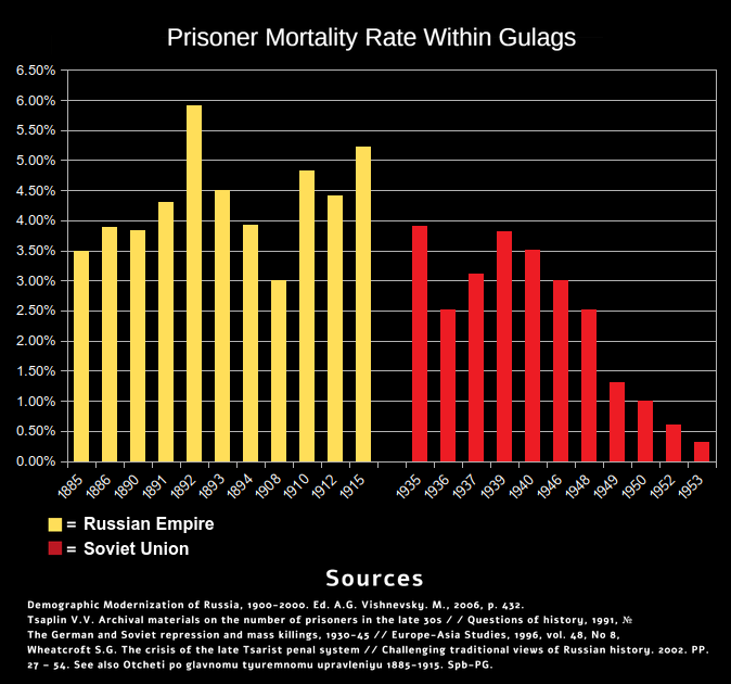
How is it misleading? It compares the GULAG years during Stalin, and the Russian Empire under Nicholas II. The skip of 38 implies that the number is not significantly different to 37 and 39 and the skipping of 1940-45 is due to WW-II and the resulting chaos throwing off counts due to this extraneous circumstance.
Implies, not confirm. Without the full numbers I have to trust the graph maker was being honest, and I've seen far too many misleading or outright false graphs to do that.
https://lefty.booru.org/index.php?page=post&s=view&id=8667 https://lefty.booru.org/index.php?page=post&s=view&id=8867 Here is another table with official numbers based on death certificates https://www.alexanderyakovlev.org/fond/issues-doc/1009320
This isn't the original one by the way. The original had an error where the Tsarist death rates were shown ten times higher because the original creator misread deaths per thousand as deaths per hundred.

Comments
Seems a bit misleading to only use certain years like that, is there an equivalent graph with every year?
How is it misleading? It compares the GULAG years during Stalin, and the Russian Empire under Nicholas II. The skip of 38 implies that the number is not significantly different to 37 and 39 and the skipping of 1940-45 is due to WW-II and the resulting chaos throwing off counts due to this extraneous circumstance.
Implies, not confirm. Without the full numbers I have to trust the graph maker was being honest, and I've seen far too many misleading or outright false graphs to do that.
https://lefty.booru.org/index.php?page=post&s=view&id=8667
https://lefty.booru.org/index.php?page=post&s=view&id=8867
Here is another table with official numbers based on death certificates
https://www.alexanderyakovlev.org/fond/issues-doc/1009320
This isn't the original one by the way. The original had an error where the Tsarist death rates were shown ten times higher because the original creator misread deaths per thousand as deaths per hundred.